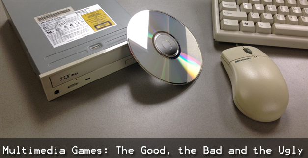
Video games in the ‘70s and ‘80s always had a unique aesthetic to them. I’m referring to their simplistic, pixelated look that included minimal frames of animation and used a small color palette. This look was mainly seen on home consoles, but games with more graphical oomph would be found in arcade games or on home computers. This was partly due to the fact that you can store more data on an arcade board with additional memory chips or span a game on multiple floppies where each disk could hold a total of 1.44MB in size; comparing this to home consoles like the Atari 2600 where a game cartridge may have only 2 – 4KB.
As time marched on so did the advancement of technology. The latter part of the ‘80s would begin introducing new devices like the CD-ROM to computers on a more massive scale. With this new storage medium, you can have more than 600MB of free space to work with! As such, restrictions for game development were loosened and, as a result, more realistic looking games could be made. This led to a lot of creativity for computer games in both visuals and gameplay experiences. The early ‘90s saw the start of this movement as game creators began going down this path.
In addition to a higher storage capacity, audio would be improved to the point where games could include voice dialog and music instead of just hearing beeps and boops. Display technology would also make it possible to have real video (or what is called Full Motion Video, or FMV) in games. All types of media like music, sounds, real video, and computer graphics would all eventually cross roads with each other in games to create a new kind of experience as some thought would be the way the industry was moving towards and would eventually mature itself into. I’m talking about multimedia games.
Not an official genre, mind you, but it does help describe games that would take advantage of using multiple types of media like what was mentioned in the previous paragraph. Home consoles like the 3DO allowed game developers to make such games, but most were found on computers. And since a license isn’t required for making games on computers, the range of quality varies greatly from fantastic works of art to, well, poop.
Fun Fact
 At the time, it was kind of tricky to know if your computer could handle these games, or other types of software, so the industry tried to help end users out by creating a guide. Labeled “Multimedia PC” it was a standard created by the Software Publishers Association and backed by companies such as Microsoft, Dell, and Creative Labs. A computer could be labeled as a Multimedia PC if it met the listed standards required for software that demanded that kind of power. For example, the 1991 standard required a computer to have the following: 16 MHz CPU, 2 MB RAM, 30 MB hard disk, 256-color/640×480 VGA video card, 1x (single speed) CD-ROM, Sound card (Creative Sound Blaster or equivalent to), and Windows 3.0 with Multimedia Extensions.
Let’s take a look at this range of multimedia games to see which ones are outstanding titles, to others that should have stayed in the minds of their creators and never should have made it to store shelves. As a disclaimer, with a focus on computers and not on consoles, the games showcased in this feature cover a few genres that include graphic adventures, interactive movies, and adventure games that may include a point-and-click interface. It also focuses on the ‘90s where this style of game flourished.
The Good
Here are some games that are shining examples of this label of being classified as a multimedia game. They use each type of media wisely -- not too much or not too little -- and deliver to the player an immersive experience without the need to beat them over the head by showing off the studio’s ability to use green screens and 3D rendering software.
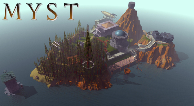
Learning from their past adventure games like The Manhole and Cosmic Osmo and the Worlds Beyond the Mackerel, the next project for the team at Cyan would be an ambitious one. Titled Myst, it would be a game that no one expected and would capture the attention of gamers for many years. Originally released in 1993 for the Mac, Myst takes you on an adventure that sucks you into its world. Heck, the game includes a subtitle that said something along that line: “The Surrealistic Adventure That Will Become Your World.”
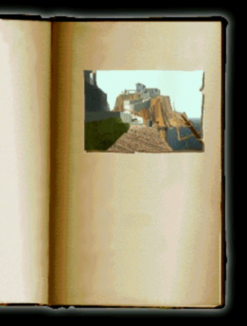
You play the game from the first-person perspective as the non-speaking protagonist known as The Stranger. The story begins as you find a book titled “Myst.” In the book is an image that is more like a window into another world. When you touch the image, you are transported to that world; in this case, the world of Myst. When you get there, you arrive on a dock on an island. No one is there to greet you and there is no way to get back to where you came from. At this point, you begin exploring the island.
And that’s one of the great aspects of Myst: there is no mission object when the game starts. You’re just plopped onto this island not knowing what to do or where to go. This forces the player to immediately begin exploring and interacting with the world. And with no time limit, the player is able to seek things out at their own pace without the dread of trying to accomplish tasks in a narrow window of time.
As described earlier, it’s a game that plays from the first-person perspective; immersing the player into its realm. Interaction with the world is performed with a point-and-click interface. Clicking on certain objects may perform an action like opening a door, turning on a switch, or grabbing an item. The worlds were displayed as 2D pre-rendered graphics, so the game presents the environments to the player one frame at a time. Meaning, as you move around the world, it will show the player another frame closer to the direction they want to move towards. Some referred to this game as an interactive side show because of this technique.
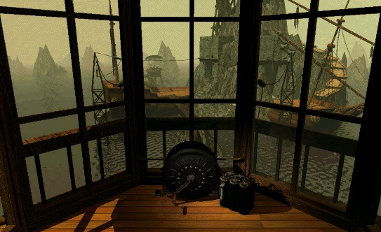
Sometimes you’ll see objects move or you will be in an object that is moving around. When this happens, a CG animated clip will take over so you can view the action. The rare number of characters you run into will be performed by real actors presented via FMV clips that are imposed over the pre-rendered backgrounds. This helps bring the world to life and gives it a more realistic look to it. The environments are also highly detailed and weathered to give it as much as a realistic look as possible. This, in part, was thanks again to the pre-rendered graphics.
As the book you interacted with at the beginning, the game includes more of these special books which link you to worlds known as “ages.” When you find one of these books, you are transported to that age by touching the page that includes an image which is animated. Progression through the game involves solving complex puzzles. Some of these puzzles are real head-scratchers and could leave you teetering on the brink of going bonkers trying to solve them. And unlike games like Resident Evil 2 where the puzzles were nonsensical, the puzzles here are finely integrated into the story within each age.
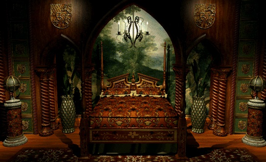
Myst is a game that, for the most part, has aged pretty well. What hasn’t are the graphics. This isn’t new to anyone as Myst has been remade may times over. The first was Myst: Masterpiece Edition in 2000. Later that same year was realMyst: Interactive 3D Edition where the game uses the in-game engine to render the environments in polygonal 3D instead of using pre-rendered still images. Then in 2014 we saw the release of realMyst: Masterpiece Edition.
Myst was known as a “killer app” for PC gaming back in the ‘90s. As such, it became the highest selling PC game until 2002 when The Sims took its crown. And as you’d expect, this led to many “Myst clones” which flooded the PC gaming scene for years to come. Some even say that Myst killed the adventure genre altogether. That’s doubtful though as there were many highly regarded gems from that style of game post Myst. Whatever people may think about it, there’s no doubt regarding the impact the game had on the industry and its way of storytelling that pulls players into its own universe.
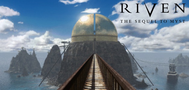
Cyan had a huge hit on their hands. Now they had to live up to the hype for their game, which at the time was their best-selling to date. How do you accomplish such a monumental task like that? Some would try to design a game that was completely different from their predecessor in both gameplay and presentation. This is, however, risky and is not always the best choice. Luckily for us, the team kept their focus in check and gave us what we wanted: more of the same.
But not exactly the same as the original. With a larger budget based on 1) a successful new IP and 2) the income from selling a ton of copies of Myst, Cyan was able to move into a new building of their own design and collect a team of talented individuals from other industries like film and animation. This would allow them to design a game where, even by today’s standards, looks incredibly realistic.
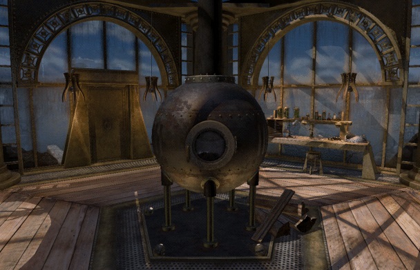
Riven: The Sequel to Myst, takes place shortly after the events of the first game. The reprised role of The Stranger will be the protagonist which the player controls. The unfinished tasks noted towards the end of Myst will be the focal point for the sequel. And as before, linking books and ages will appear in Riven, but not taking center stage as much as they did in Myst. Instead, there is one massive world that’s been partitioned into smaller chunks. Exploring these locations is highly important as objects can be found off paths and hidden around corners.
As before from the original, Riven presents itself from the first-person perspective and uses the point-and-click interface. Returning are the pre-rendered still images that show-off the world and FMV clips which include live actors for story elements and bringing the world some life. However, everything is presented on a much larger scale. Textures taken from photos of real world objects now wrap the geometry of objects in the game. Lighting and shadowing are used more so than ever to convey both extreme contracts of light. For example, there are beach-like areas that are bathed in direct sunlight while other places are dimly lit caves that desperately pull what little light there is together and have it reflect off the walls so the player can keep their bearings.
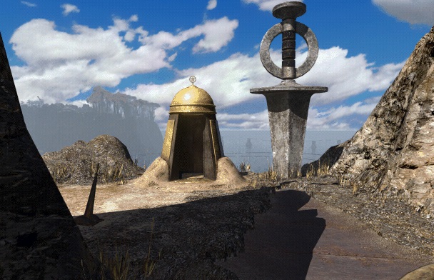
While playing Riven, you will notice there is less mist as there was in Myst. Every still image in Riven is like a work of art. You can see for miles in any direction and see islands, buildings, and structures that are way off in the distance. There are more characters in the game, too. There isn’t any interaction with most of them, but they do fill in the world and give it a vibe that things actually happen there. This is a contrast to Myst where all the ages looked sterile and seem like the places you visited were abandoned shortly before you arrived.
Best thing they did was keeping the gameplay the same from the original: you click on items and see the world one frame at a time from the first-person perspective. If you’ve played Myst, you’ll feel right at home. I can’t imagine the world looking as good as it does if they decided to render it with a real-time graphics engine. Sure, moving around a 3D environment would have looked amazing in 1997, but it would have aged the game relatively quickly. They would eventually tweak this formula when they released Uru: Ages Beyond Myst where it takes place from the third-person perspective and is rendering the world in real-time.
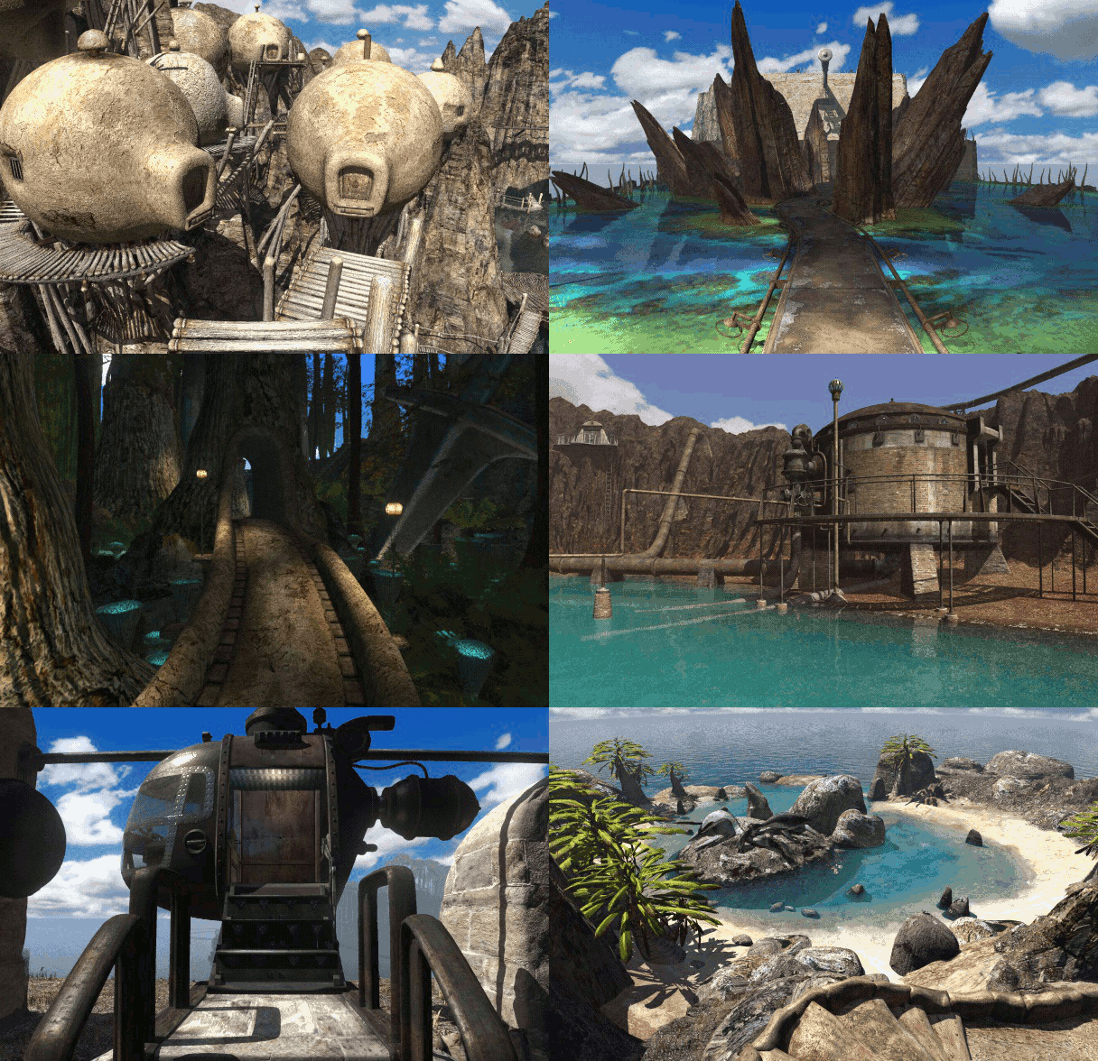
Riven was massive, and when it originally came out, it was spread across five CDs! Even after a year behind their projected released date, the game was received with positive reviews. It didn’t shatter any records like Myst did, but it was the best-selling game for 1997. Cyan would not be an exclusive developer for the whole Myst series, though. Cyan would give permission to studios like Presto Studios and Ubisoft for making other sequels. Cyan would, however, bring things together for the final game in the series with Myst V: End of Ages. Although these other games came out, Riven was given a perfect ending that would have satisfied anyone who played Myst. The others just expanded on the story by filing in gaps.
The Bad
These games are not terrible, but you wouldn’t praise them to others as being something worth playing. This could be due to the fact that they may have lost their charm somewhere in the middle; where the second half just gets repetitive with its media, like an overused sound clip. This is where a longplay video may come in handy. Just watch it; don’t play it.

Multimedia type games were on the decline in 1996, but studio 7th Level thought it was the perfect medium to be used for Monty Python & the Quest for the Holy Grail. This, however, was not their first Monty Python game. Their first crack with the license was a few years earlier in 1994 when they released Monty Python's Complete Waste of Time. And rightfully so: it’s a waste of time. Using the TV show Monty Python's Flying Circus as its focal point, it is a collection of minigames, wallpapers, screensavers, and icons. Clicking on spots of a static screen will reveal an animation sequence, a video clip from the show, or other type of wackiness that was from Flying Circus. Sort of a practice run, it would get them ready for the Holy Grail game.
Being based on the movie does tend to help. With Complete Waste of Time, you couldn’t really call it a game, as there was no goal. With Holy Grail, it uses the plot of movie, so you are given the task of seeking the artifact noted in the title. But the game doesn’t start right away. When you begin the game, you see an icon of the grail and are given three buttons: [Collect the Grail], [See the Film], and [Register Now]. Clicking the Collect the Grail button, the grail icon above the buttons begins to flash and then you are shown a quest complete screen noting that you’ve found it and the game is over. At this point you are dumped back to the desktop. Clicking the See the Film button will show the full movie…in about 10 seconds.
Clicking the Register Now button will have you answer a series of questions that include multiple choice and fill-in-the-blank answers. Get comfortable because there are over a hundred of these questions you’ll need to answer! After all that is when the real game finally begins. The narrator will pop in at the beginning and fill you in on your quest to capture the Holy Grail.
Staying very true to the movie, the game includes most of the scenes from the film, with each scene having its own static background image with animated characters and objects in the foreground. Some scenes will include a minigame that has a related theme to it. For example, when going through the village where a plague has struck and killed many, there will be a Tetris clone called Drop Dead that has bodies in the shape of each Tetris piece. As you play this minigame, you’ll hear audio snippets from the movie where the man that’s trying to convince others that he’s still alive. You will hear quotes like “I’m not dead!” and “I feel fine!” over and over.
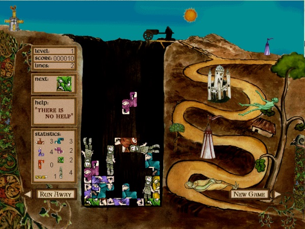
Speaking of which, the game is jammed packed with audio and videos snippets from the movie. The game goes into so much details that it’s kind of annoying due to them repeating a lot. The main objective of the game is to collect items and place them into your inventory. Some are rather tricky to find and require you to click every square inch of each scene to find something. Afterwards, you will need to place the items you found into other scenes that are missing them.
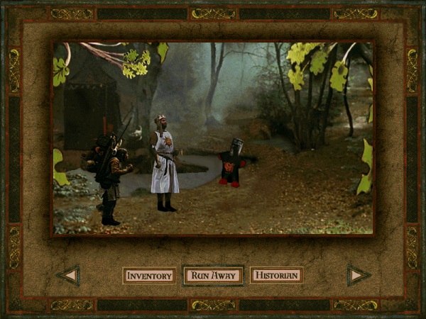
A positive regarding Holy Grail is that it includes credits from a few of the original Monty Python crew. Terry Jones and Terry Gilliam were the Directors for this game. Eric Idle was a Writing Consultant and Executive Producer while Michael Palin assisted by lending his voice. I assume not very many people would stick around to play the game all the way to get the grail due to its difficulty. Difficult because it’s not explained within the game that you need to find and place items in the correct spots (maybe it was explained in the manual), but I’m sure die-hard fans of the movie would appreciate the humor and all of the references which are peppered throughout the game. When it comes to Monty Python & the Quest for the Holy Grail, King Author said it best: “RUN AWAY!”

The Star Wars franchise in the early 1990’s was in a bit of a slump. Nearly a decade since the last movie was released and years before the next trilogy of films would debut, there was not much they could have done to expand on the universe other than to release novels, and of course, games; and boy did they heavily invest in the latter.
Around this time there were a number of Star Wars games that came out that fans hold near and dear to their hearts. Super Star Wars, for one, was an SNES game that followed the story from the first film. There was also Star Wars: TIE Fighter, a space flight simulator that won numerous awards and became a favorite to many. These were two of about 18 Star Wars games that were released between 1991 and 1995! Some were good and were praised by both fans and critics, while others…not so much. One of those “not so much” games were from a short lived series of games called Rebel Assault.
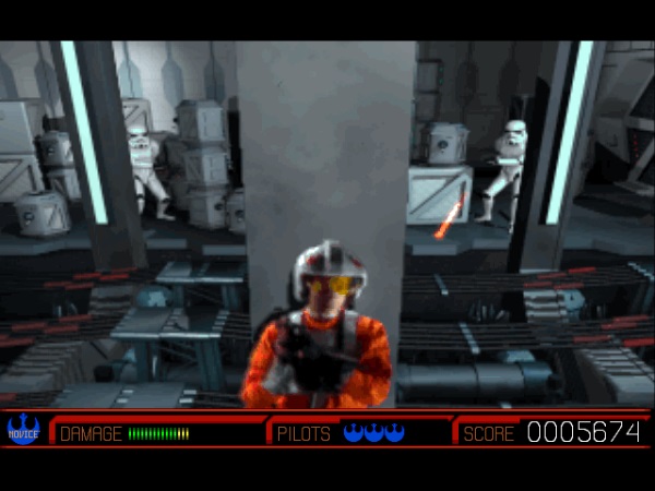
Star Wars: Rebel Assault II: The Hidden Empire was a game released in 1995 by LucasArts and was the sequel to the 1993 game Star Wars: Rebel Assault. The first game was basically a hashed version of the original trilogy that took many scenes from the films and had the player interact with them. You played as a young Rebel pilot named Rookie One. Rebel Assault II goes more original with its story where it follows an investigation to the Empire’s secret fleet of ghost ships. Where again, you play as Rookie One.
Being a rail shooter, there’s not a whole lot you can do in terms of gameplay besides aiming and shooting. But what the game exceeds at is how it tricks you into thinking there’s more variety to its gameplay.
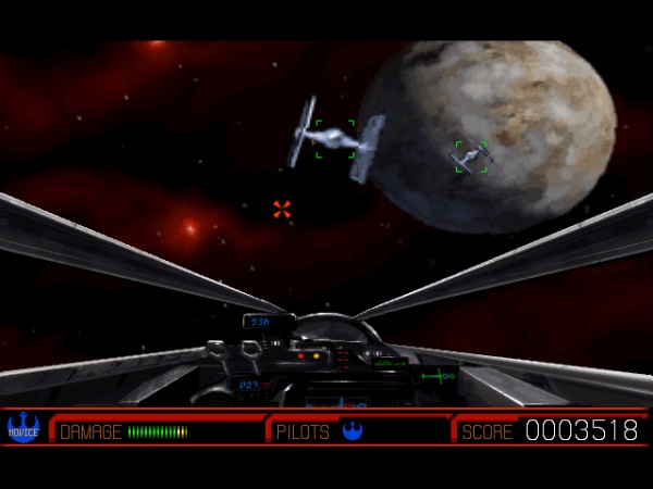
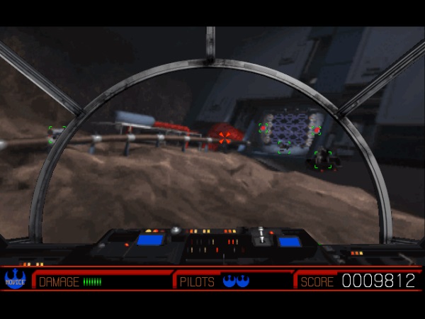
Each level is broken down into one of four different modes of play. One is a traditional space shooter, another is a Time Crisis styled cover system, the third is a “rail flyer”, and the last is the previous but with also shooting. Each mode will appear a number of times throughout the game, but with different sceneries to keep things looking somewhat fresh. For example, for the “rail flyer” mode of gameplay, one level will have you controlling a YT-1300 (a Millennium Falcon) through a twisty mining tunnel, while another level has a TIE fighter zipping around the inside of a narrow canyon.
In the levels where you are controlling a vehicle, there isn’t too much in terms of control, except to not hit any obstructions that are in your way. These levels don’t render polygons in real time. Instead is a pre-rendered cutscene where you zoom through tight spaces. The impressive aspect of this is that everything has a photorealistic look to it. They did a great job of lighting and shadows -- thanks in part to the INSANE engine that LucasArts developed and used for a number of their games -- but these videos are highly compressed, so everything has a muddy filtered look to it.
Unlike the first game that took clips from the films and butchered the heck out of them to make them work for their own storied cutescenes (where most ended up looking like those via satellite interviews Conan O'Brien used to do), Rebel Assault II hired actors and filmed most of these cutscenes. They even used costumes from the films like the Stormtrooper uniforms and Rebel pilot suits to bring some authenticity to the game. Unfortunately this is one of the few positives this game has.
Rebel Assault II does have its merits, so it’s not a terrible game, but it’s one that most Star Wars fans tend to pass up and forget. Why? Probably because it’s more like a movie rather than a game. The interactivity is limited compared to other games for the franchise, and can be unforgivable in terms of difficulty in some parts. Rebel Assault II tried to appeal to everyone with different looks of gameplay, but did a mediocre job at each one, creating a less than stellar experience. In addition, players saw past the smoke and mirrors and knew it was nothing more than a rail shooter.
The Ugly
Heaping piles of you know what. Not only would you not recommend these games to anyone, but you would try to wipe them from your memory as the notion of accidently telling someone to play them may result in a public shaming or possible arrest. Don’t play, don’t watch a video. Just read this or their Wikipedia pages.
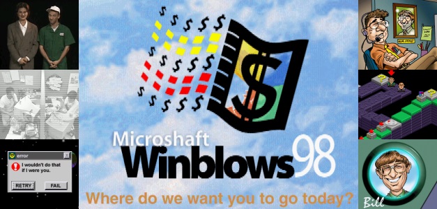
It was easy to rag on Microsoft in the ‘90s. Back during that decade they were the goliath of the computer software market and were seen as a threat from not only their competition but from end consumers as well. And to give the company a face, CEO Bill Gates didn’t help much with his combative attitude that was well known both behind closed doors and during open forums like interviews and conferences. And as the company grew, from the eyes of the government, they were seen as a threat in the form of a monopoly, so the United States Department of Justice started an investigation in 1993 which was settled a year later when Microsoft contested they would not tie other Microsoft products to the Windows OS.
 The DOJ would eventually take Microsoft to court in 1998 for an antitrust case where they felt they were in violation of abusing their power of monopoly by incorporating their other products into Windows. The biggest being their web browser, Internet Explorer. With so much controversy revolving around one company, there’s no shock to hear people did not care for Microsoft or their leader. The late ‘90s is when a lot of anti-Microsoft sentiment was being waved around like a flag of protest. This would be near the time when the shorthand “M$” came to be and was seen throughout the internet. And to cash in on all this negativity towards Microsoft, a small game studio named Parroty Interactive decided to create a “game” centered on all the controversy.
Titled Microshaft Winblows 98, this game is a parody on, at the time, the soon to be released Microsoft Windows 98 operating system. Included as the main interface for the game is a fun house mirrored styled version of the Windows desktop. It includes certain elements that users of the Windows OS will know such as the taskbar, Start button, desktop icons, and folder windows; but looked and functioned in odd ways. For example, if you click the Start button and then highlight an option from the Start menu so it could expand a submenu of items (like the All Programs menu), you will continue to receive a cascading number of submenus until the OS eventually “errors out.” Folder windows will be oddly shaped, too like clouds.
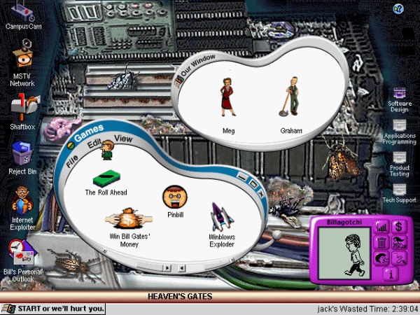
One of these windows is a folder of mini-games you can play whenever you want. One is a pinball game that features a very weird looking Bill Gates while another called “The Roll Ahead” (a play on Gates’ book, The Road Ahead) is a board style game where you battle against Steve Jobs. Another game is called “Windows Exploder” where you play a buggy game that’s full of error messages. Shooting those error messages will expose a number of creatures (bugs, get it?) which you will need to shoot to gather points. The last game is called “Win Bill Gates’ Money” and it’s a trivia game that is a play on, you guessed it, the Comedy Central game show Win Ben Stein's Money. Oh yeah, I forgot to mention earlier that not only is this a parody on the Windows operating system, but it also includes a lot of Bill Gates humor and how he has a ton of cash and doesn’t care about anyone besides making more money.
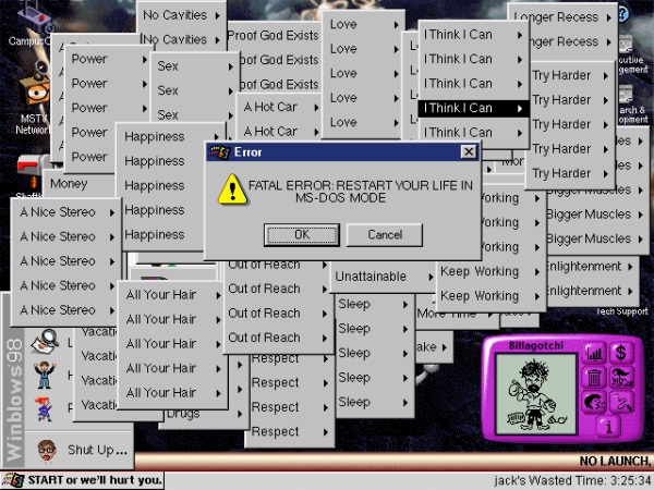
Believe or not, there are actually goals and objective in Winblows 98, but it’s barely held together with a thinly twined string of a story. Hosting the game are two Microshaft employees, Meg and Graham. Meg is the “Personal Assistant to the Executive Assistant to Bill Gates” who hates her job while Graham is a janitor who is actually a programmer and hacker that has a high respect for Bill and plans to work his way up the ranks so he can one day “program applications for the big guy himself.” The player will work alongside with these two as they introduce their secret program called Winblows 98 (a program created by Meg and where Graham assisted by programming) to others in the company, with the exception of executive management. This means the player will pass this program along different departments such as: tech support, product testing, and applications programming.
While in each department, the player will need to accomplish a number of tasks before getting an email with a cryptic hint for a password so they can move to the next department. The tasks are nothing but watching a number of FMVs that act like surveillance cameras for the Microshaft campus, which show odd behaviors of employee life at the campus; TV shows from the MSTV Network, which are parodies of real TV shows but are shown as a series of illustrated slides; looking over rejected products of Microshaft like “MS Office Suite Crime Edition;” and reading emails, journals, and calendar events from Bill’s personal Outlook.
As horrible as this game was, there were a few small laughs to be had. Hidden as Easter eggs by clicking random spots on the desktop are short audio clips of bloopers. Another small laugh was during the Star Trek TNG parody show, Star Tech: The NeXT Generation, where Bill Gates (acting as Picard) orders the photon torpedoes to be fired on the USS Netscape, only to fail when the button is pressed. Data explains what may have happened by saying, “the MS Explorer recently upgraded to Windows 2598 and some of our weapons systems will not come online. Maybe an incompatibility with the older drivers. Starfleet technical support has been busy all morning.” Gates replies with a low toned, “damn.”
As with any topical form of entertainment, it will have a very short expiration date. Anyone who did not live during the ‘90s will probably not understand the references or why there is so much hate towards Bill Gates. If anything, they would probably wonder why Steve Jobs didn’t have a bigger role in the game or why he wasn’t the main target. In any case, Microshaft Winblows 98 is one of those games that are okay to leave behind and have the sands of time bury it so no one could have the misfortune of accidently playing.
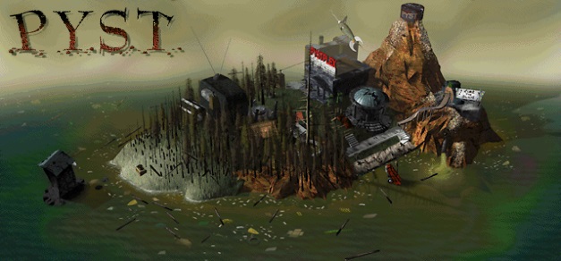
Bookending this feature of multimedia games, let’s take a look at a title that leeched off the success of the first game that was the focus of this feature. Released in 1996, Pyst is a parody of Myst. Yep, this is another parody game from our friends at Parroty Interactive, but instead of poking fun at an operating system, the company, and its CEO, we get to laugh at the most successful game ever made. Buckle up, this is going to be a bumpy ride.
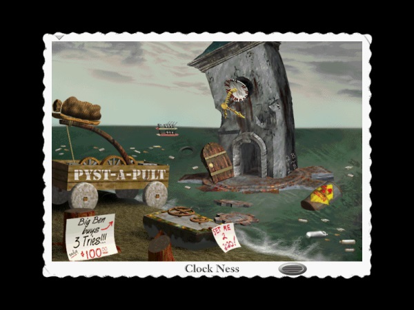
The setting of Pyst shows what Myst Island would look like after millions of players have visited it. The island’s once beautiful landscapes and romantic styled buildings have been violated by the many guests that already explored it before you got there. In their wake is an island that is covered with litter, graffiti, polluted beaches, and dilapidated structures. The sky is overcast with an ugly yellowish hue and most of the forest has been burned.
The game is played from the first-person perspective, but each slide is presented as a photograph with an uneven, white-margined edge like an old timey photo would look. Each of these photos include a text description of the scene and a speaker icon you can click where you’ll hear the voices of two tour guides, Bob and Sheryl, explaining the current scene. Their dialog tries to be funny, but usually falls flat with mediocre wisecracks. A company named Octoplex has bought the island and is turning it into a tourist destination. For an example, the iconic dock where the original Myst starts the player at will be demolished and turned into a Jet Ski marina and ferry landing.
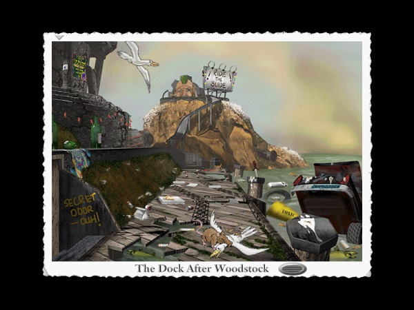
There’s not much exploring in Pyst compared to Myst. There are no puzzles to solve and there are no books to read. Each scene will have a number of items you can click on and will either queue up an animated clip or audio track. Every location will also include two postcards guests have written to family or friends which you can read. Again, they try to be humorous, but nothing really stands out.
You can’t go everywhere on the island like in the original, but you’ll get to see most of the primary spots like the dock, library, clock tower, and log cabin. Every location will have its own music and it’s actually impressive of how close they got to parody the music. It definitely has that Myst vibe when you hear it, especially in the Dimensional Imager room. Most of the sound effects are mouthed, so you get that Michael Winslow sound to everything.
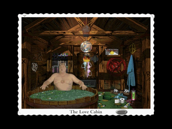
The few characters you see are real actors in FMV clips. The brothers make an appearance and are portrayed to the extremes. One is a sissy that’s afraid of everything while the other is a frat boy always hitting on the ladies. Ruler of Pyst Island, King Mattress, is played by no other than John Goodman. My goodness! How can a great actor like him be attached to such a thing like Pyst? Was he a fan of Myst? Games in general? To compliment his southern background, the game includes a song sung by no other than John, too. It’s in the style of music from New Orleans and has no connection to the game other than being titled “I'm Pyst.” While the music and the singers sound great, the lyrics are of less quality.
Pyst is a very short game where everything could be seen in about an hour. Accompanying the game is a making of movie that shows the staff, cast, and crew who made the game. This video was way more entertaining than what the game had to offer, so that should be a good way to measure just how terrible this game is. This was Parroty Interactive’s first title and probably most successful. With its success they were able to fund three other games before going under a few years later in 1998. The others include a parody of The X-Files called The X-Fools, one from Star Wars called Star Warped, and of course, Microshaft Winblows 98.

A product of its time, there doesn’t appear to be much of a demand for this kind of game anymore when compared to other eras of gaming with their own unique aesthetics. 8-bit and 16-bit styled games got a second chance in popularity during the late ‘00s partly in thanks to the indie scene, and games with isometric camera angles have made a comeback within the last few years with games like Torchlight, Diablo 3, and Dota 2.
This may be because technology at the time was at a point where it was undergoing a transition from 2D to 3D; and we all know transitions are always ugly. Where it may have been too expensive to develop a game fully in polygonal 3D, but at the same time its simplistic look would degrade the realism of the world because of things like simplistic textures wrapped over polygonal objects or the limitations of polygon rendering that prevented having nicely rounded objects. If visuals needed a look of realism then having FMVs with real actors is what was recommended to achieve this goal.
The “wow” factor played an important role, too. Myst’s “wow” factor came from the fact that it was using a combination of all types of media that could only come from using CD-ROM technology. Rebel Assault II came from polishing up what they did with the first game by having it be an FMV game complete with original cutscenes that were filmed just for the game; giving it that Lucasfilm touch.
But as technology got less expensive to create 3D games and have them rendered in real time, the act of having FMVs and to have actors play out the roles were phased out. A definite plus the industry no doubt (in regards to the cost of production), but it did ultimately shift the direction people thought interactive media was moving towards during the early 1990s. Although this style of game is now just a moment in time for the medium, it does have its fans; both the authentic and ironic. For the authentic, Tesla Effect: A Tex Murphy Adventure was released last year in 2014 from a Kickstarter campaign, and for the ironic, games like Roundabout and Wavy Tube Man Chronicles bring the silliness that only FMVs can deliver. And with games like these coming out every so often, I guess you can say this style of “multimedia game” still lives on.
Image credits: Wikipedia
Posted on: May 14, 2015
